Razorpay Assignment.
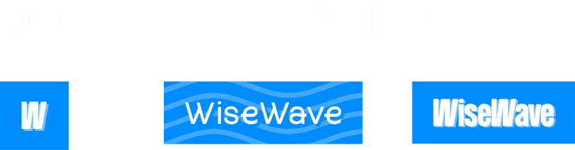
WIsewave
Introducing wise wave
Scenario:
Objective:
Design the onboarding journey of the WiseWave, an app tailored for international college students. Use delightful motion design elements and micro interactions that enhance the user experience, making the onboarding process engaging, intuitive, and memorable.
Showcase 4 screens to depict the onboarding journey for a first time user for wisewave.
• Splash Screen Animation
• Welcome Screen Animation
• Step-by-Step Onboarding Animations
• Complete/Success Animation
Time frame:
~4 days
My Role:
Product design - Branding, UI/UX, Graphic design, Motion design (UX), Hand-off for developers.
For users
When choosing a service to send money to international students, it's important to consider factors like transfer fees, exchange rates, speed of delivery, and ease of use.
Actively making the user focus on the solutions to their problems is necessary to provide a good experience and for the user to meet their end goal.
For me
To build a brand personality, I wanted to cover the key-words through different aspects of the design that I’ll be using.
How different design elements can be used to convey these brand personalities.
Visual cues: Vibrant-Colours, Shapes, Illustrations relating to the target audience.
Emotions via design: Rigid feel (shapes, layouts & interpolation of motion), short & apt UI and good UX copy that aligns with the tone of the age group of college students-particularly.
Wisewave as a friend: transparency, snappy UI, interactive buttons, transition, track of progress, helping in nature (Give assistance wherever required, give a genuine reaction & sense of reliability when the user depends on the friend/app).
What I kept in mind
I made sure all the animations done by only using basic transformations like, position, opacity, scale, rotation to support smooth lottie exports. keeping keyframes to a minimum as it bloats the file size.
Don’t compromise the animation instead use some different approach to achieve results like masking. As masking/feather, track matte are not supported in lottie.
Assumptions:
Assumptions:
Although only one animation is dependent on users actions but rive will be our main way to implement the animations instead Lottie.
Fonts:
I shortlisted the above to fonts to go with the brand personality of the app Where the primary interface makes the app Modern & Energetic when combined with motion and appropriate interpolation in the movement/transitions. Mostly used in Titles & Headings. While the secondary interface was chosen for it’s readability is used mostly in body/interface texts.
Colors:
For keeping the visuals of the app vibrant, friendly. I sorted these colours along with tints & shades of these colours to be used in icons, illustrations, text. I have not defined all semantic colours in this project as they fall out of the scope because only onboarding screens were needed.

Logo
Keeping the logo very simple, the two W’s indicate to the W’s of WiseWave The sense of “Wave” can be provided through motion (refer to splash screen in the video).
Splash
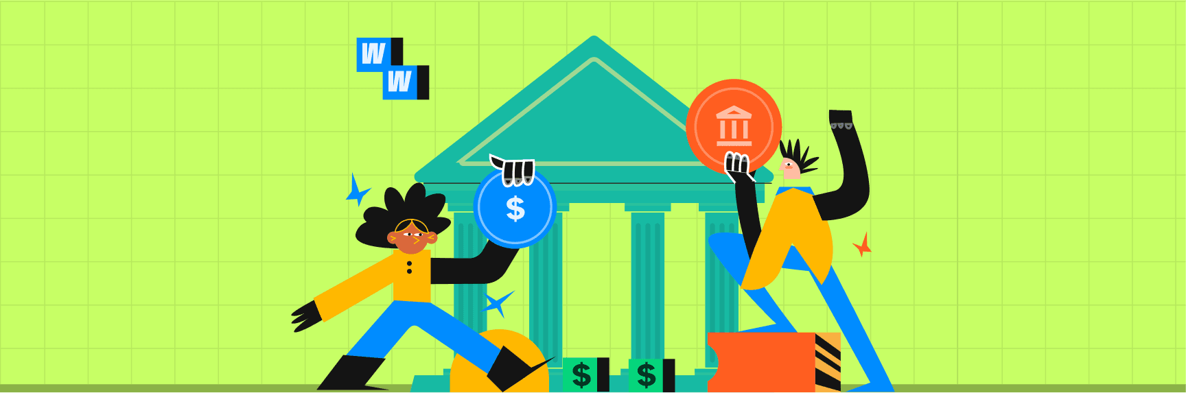
In the timeline of onboarding (can be continued in app UI also), all colours are treated to show a solution-property the app provides. The other colours than blue follows the motion of the primary block and collapse into to form the whole product. (individual properties of WiseWave into one entity)
From here splash can lead to the welcome screen and rest of the on-boarding in case user opens the app for first time.
Or the splash can lead to the home-page of them app.
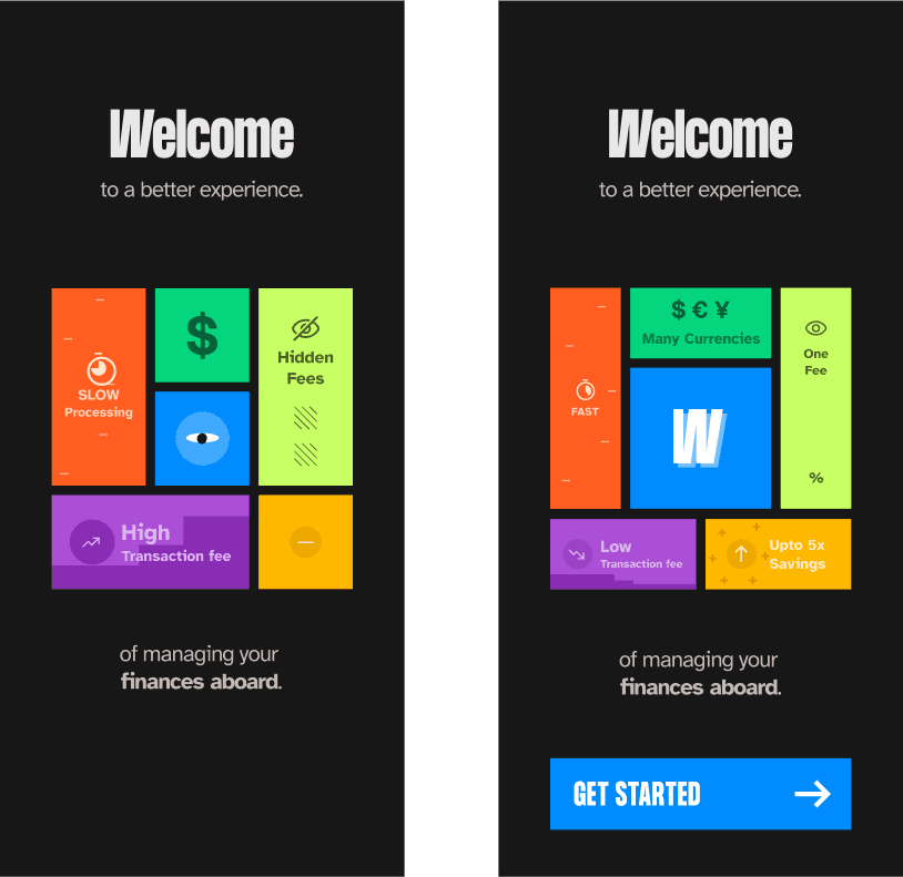
Welcome Screen
Frame-1: As the problems around the student’s abroad expand in size, showing the importance & attention they required followed by an eye (eye of the trade-mark character of the whole project).
Frame-2: Sections containing troubling factor of a student abroad contract to a smaller size (but no zero, as transaction fee cannot be zero, a fee is always there). and rewards factors of using the app expand in size (like more currency options, savings) while the W is introduced in the center section/box to show when WiseWave comes and it provides solutions and rewards for using this app.
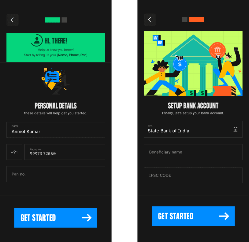
On-boarding Screens
Screen-1: Takes personal information like Name, Phone, Pan. with the assumption, verifying pan is can be excluded in this project. The circle closing like a radial-progress bar (refer animation) indicates the user about the progress of the current info required. The green card then shows a small success tick animation to how the personal information is saved. Screen-2 Here minimal animations will be used as user inputs an important data. Just a static illustration is displayed. Assets of the illustrations is used in future screens in the process to maintain consistency in the story of the journey.
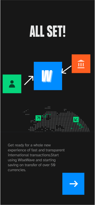
Success/Completion
The info saved while taking info from the user is showed again visually,
Green card - Personal info, Orange card - bank details moves into the logo of WiseWave and converts into a success state.
The animation below depicts the transfers across the world through the WiseWave app. User can now move to the homepage of the app.
Size of animations
Splash: 16kB.
Splash+Welcome: 172kB.
info-card: 53kB.
Success-animations: 217kB. (One asset is a non compressed png, using svg in that case exports a 2.7mB file, which is not optimal in this case)
Button Press + Loader data: 24kB | ~30kB for Rive with state-machines.
Total size of the animations delivered: ~500kB
Screen transitions
📈 Cubic-bezier[0.10, -0.00, 0.10, 1.00] , 650ms.
Data for devs to implement the same transition as in the video
Screens Transition occurs when user pressed “get started” on the welcome screen and
on the final button “→” to finish onboarding.
